Talkdesk Resource Center
Talkdesk is a cloud-based customer service software company that provides contact center solutions. Our goal was to create a user-friendly resource center that simplifies content discovery and helps users achieve their objectives while improving engagement, conversion rate optimization (CRO), and the overall user experience.

Team
Lead UX Designer
Product Owner
2 Developers
Design Manager
Seo Manager
My role
From creating the research strategy, conducting the interviews, compiling the findings and generating insights, to developing the new resource center area, I was responsible for the entire research and design process. I oversaw the effort to engage and build relationships with relevant stakeholders and developers, which led to cross-team cooperation.
Problem space
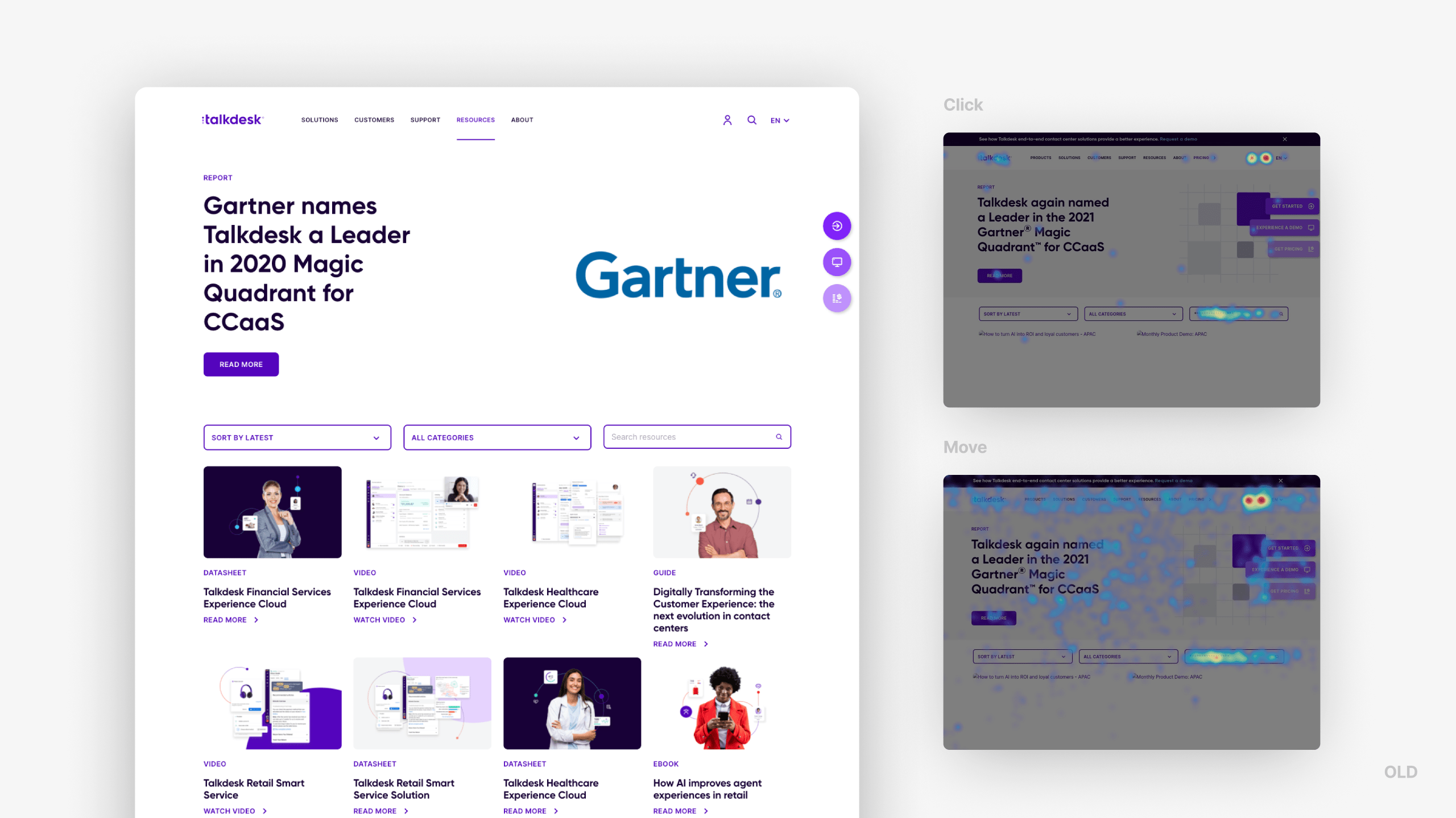
Upon arrival at the Resource Area, users did not engage much with the resource displayed above the fold. This was likely due to the fact that he has a huge hero section that only displays one static resource at a time, which goes against best UX practices.
Additionally, updates to the hero section were infrequent. As a result, users tended to rely heavily on the search capabilities, with 87% of primary actions related to using either the global search bar or the search input within the page.
The sorting options available – “Sort by date” and “Filter by type of asset” (labeled as categories) – were located below the hero section and close to the fold, but were rarely used. Users expect to be guided to relevant content, but this structure only provided a hero section, sorting capabilities, and a search function, requiring users to scroll to find desired content.
The prioritization of content is a crucial step in the content-planning process, and the current setup led to low content discoverability, difficulty in searching and filtering for content, lack of recognition of interested content, and increased memory load due to a lack of proper categorization.

Uncovering user insights
Through conducting a thorough Generative research, which involved user interviews, surveys and competitor analysis, we were able to validate our assumptions. This allowed us to identify the root cause of the problem and gain valuable insights into the needs and pain points of users, as well as understand the competitive landscape.
Based on our findings, we discovered that users with clear objectives tend to use the search function and rely on suggestions to quickly find relevant content. On the other hand, users who are uncertain of their goals are more willing to spend time browsing and searching for relevant content, often relying on highlighted content to guide them.

Problem statement
How might we help Talkdesk customers to find centralized useful and relevant information about Talkdesk products and services by providing a better user experience and helping users to find the information they need more easily?
First explorations
Enhancing the search experience and promoting greater engagement with resources can be achieved through various means.
These include highlighting the search input and providing personalized category suggestions, as well as utilizing categories and filters to facilitate navigation and accelerate the discovery of relevant content.
The user should be encouraged to perform the most commonly performed actions and be reminded of trending and campaigning above the fold.
To further empower users, combining categories and enabling searches across multiple types of assets can be beneficial. Additionally, images can be utilized to identify different types of assets, allowing users to locate desired content with greater efficiency.
To maintain user engagement, it is important to avoid displaying empty states with no results, instead offering alternative suggestions or providing additional information to keep the user engaged.

Solution
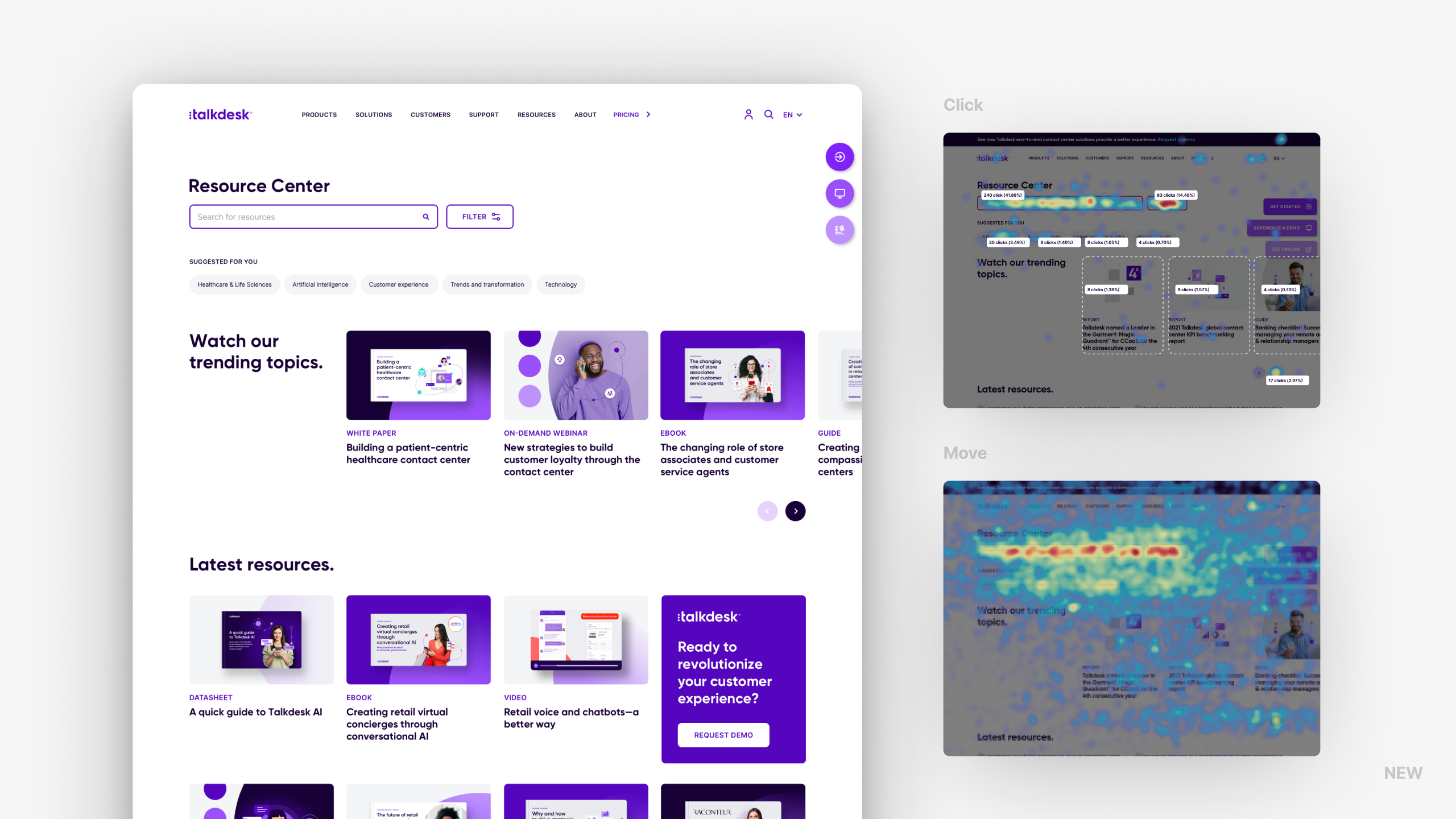
In conclusion, the solution we designed for the resource center included several changes, highlighting the search input at the top and personalized category suggestions to improve the search experience, as well as suggested categories and filters to help users navigate and quickly find relevant content.
Placing more relevant content above the fold also improved usability, while using visual cues such as images revealing the type of resource helped users find what they were looking for more easily.
Overall, most of these features came together to create an engaging and intuitive resources center, showcasing Talkdesk’s expertise and positioning the company as a trusted resource in the industry.


Takeaways
After implementing the CRO strategies, the macro conversion rate increased by 6,26%, indicating a significant improvement in the effectiveness of the website. Micro conversions provide essential visibility into the holistic user experience improvements. The new version has seen an increase in interactions with the input search and filter functions, with a 42% and 14.5% increase respectively.
Certain suggested categories have received more clicks than the call-to-action button on the old version hero section.
The trending topics section has received 2.97% of clicks, indicating user interest in interactive content.
The new version has more content available above the fold, including at least three resource cards on trending topics and five suggested categories with over 5% of interactions globally.
The heatmap shows a decrease in clicks on the Talkdesk logo, global search, and login, suggesting that users are finding the input search function more helpful and recognizable.


More works
YMC
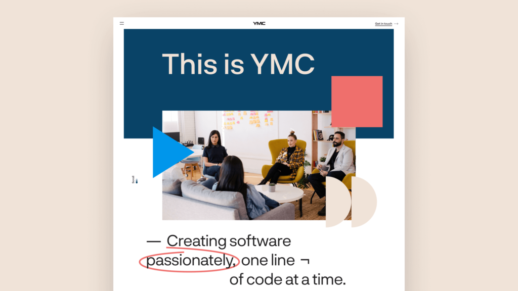
Redesigned to improve the user experience and modernize the design of YMC’s website, creating a more engaging and accessible online presence for the company.
Duque 70
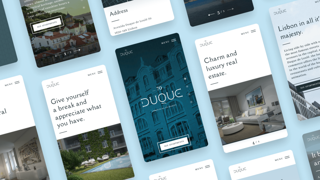
Designed a real estate website to improve the user experience, increase leads, and help potential buyers easily find their dream home.

